A Picture Tells a Thousand Words
Using a picture and visual graphics to represent data and information is called an infographic. It is a great way to display statistical data that shows comparisons or charts that come from research and reports. These are more healthcare infographics I have come across lately. See previously discovered healthcare infographics.
 Meaningful Use Incentive and Penalty Scenarios: Medicare
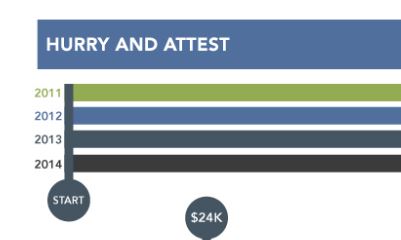
ECG Management Consultants have outlined the Medicare payment adjustment scenarios when you skip years of the EHR Incentive program in this infographic. Providers should consider how skipping an attestation year could lead to future penalties and diminished incentives. Given the variety of potential combinations of incentives and penalties, EPs should review the guidelines and scenarios carefully prior to skipping a year of attestation or dropping out of the incentive program alltogether.
 What makes patient engagement in Stage 2 MU hard for doctors?
Patient engagement in Stage 2 Meaningful Use – Pitfalls, Impediments and Avenues. The revenue cycle masters at Billing Paradise have created this infographic outlining the challenges being faced in getting to stage 2 of meaningful use. First you have to successfully complete stage 1. Included also is a recent PHI survey conducted by the AHIMA Foundation and the Texas State University. It is loaded with spanking new facts about the PHI access.
 HIT Industry Outlook Survey
The 2014 HIT Industry Outlook Survey was conducted during HIMSS14. It depicts industry’s feedback regarding issues including meaningful use, ICD-10, and big data. Meaningful Use achievement continues to thwart hospital IT departments and care team professionals, and most feel they haven’t gotten everything out of it yet. A lack of resources continues to beleaguer the meaningful use process, and now priorities are shifting to the upcoming challenges of ICD-10 transition and what to do with all that data. This infographic is brought to you by Stoltenberg Consulting Inc.
